
Fiddling with breakpoints, screen sizes and weird mobile behaviours. It is a headache. That is why every landing page template we deliver is baked with responsive design from the start. No tinkering required.
Whether you are showing off a food menu on a phone or a real estate portfolio on a widescreen display, your content flexes to fit. And yes, it is Bootstrap-friendly, so if you do want to tweak something later on, it will be a walk in the park. Think of it as design that knows how to behave properly - even when the user does not.
It just... adapts. Like one of those travel mugs that somehow fits in any cup holder.
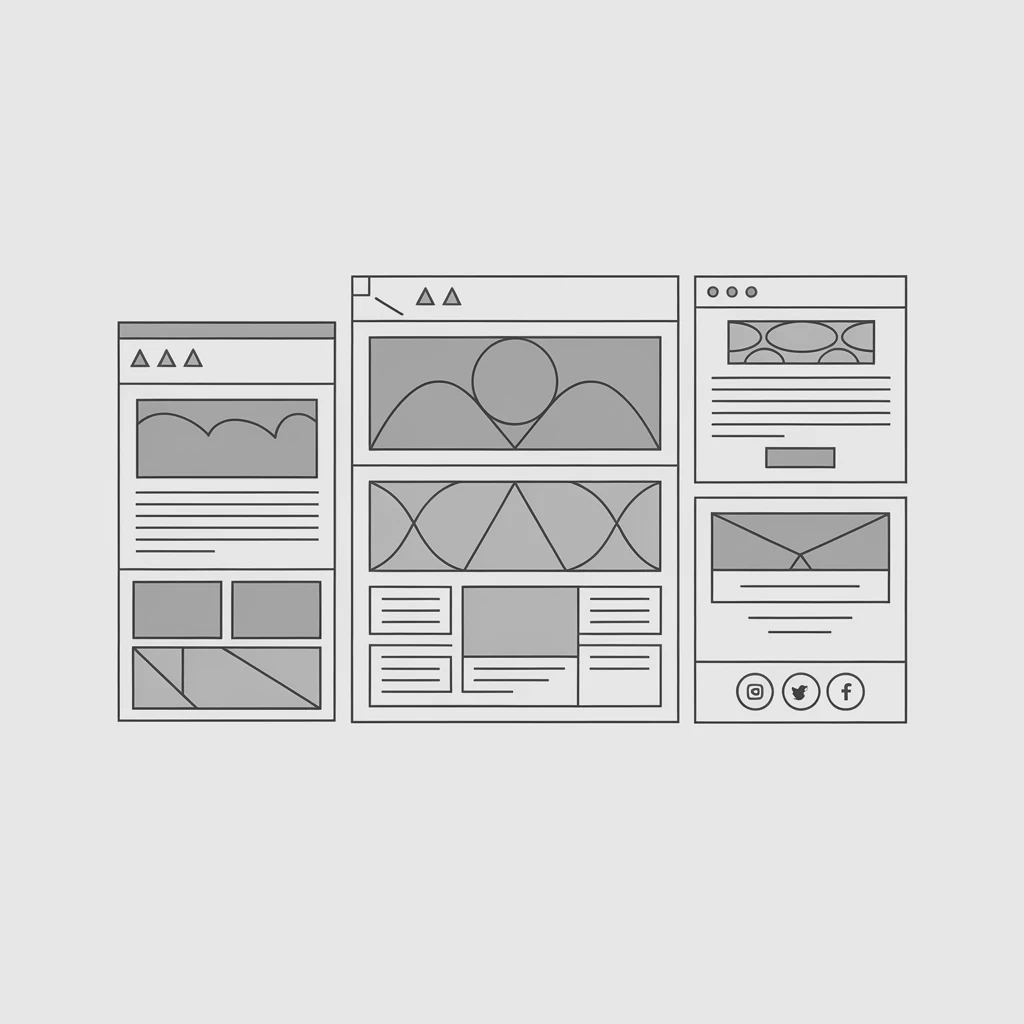
Blank canvas syndrome? Not anymore. Our AI listens to what you want - education site, marketing splash page, mobile app hub, photography showcase - and delivers a structured wireframe tailored to your goal. Not generic. Yours.
We combine smart defaults with design best practices. So even if you are not sure what 'good structure' looks like, the system gently nudges everything into place. Like a puzzle solving itself while you sip your coffee (or scroll aimlessly - no judgement).
Want to go from wireframe to wow? Just swap in some Sketch mockups or real content later - or do not. Sometimes what the AI does out of the box just feels right. Weird, huh?

Okay, so you have got a gorgeous landing page. Nice. But what is it doing? Is it catching leads? Pushing signups? Booking webinars?
Our templates are tuned for one thing - results. Whether it is for a tech product launch, an event RSVP, or a cheeky portfolio teaser, the layout and copy framework are shaped to nudge users towards action. That is kind of the point.
Even if you use Wordpress or a custom setup, we have made it simple to plug in and go. And do not worry about forms breaking on mobile - they are built with love (and Bootstrap). Honestly, that is half the battle.
Good question. It is about clear focus, mobile-friendly layout, fast loading and a single call to action that does not get lost. Ours tick those boxes and then some.
Nope. Our AI handles the structure, layout and even style hints. That said, if you have got assets from Sketch or similar, they are easy to integrate.
Yeah, totally. We keep compatibility smooth - even when the tech gets messy behind the curtain. Wordpress users often copy-paste the sections into their builders.
That is the plan. We use proven layouts from marketing campaigns - from real estate to food services - and blend that with AI logic to prompt action naturally.
Yep. Mobile app pages are one of our most requested setups. The templates are punchy, scroll-optimised and perfect for showcasing app features or signup buttons.
Then you will love how image-focused our layouts can be. Clean framing, responsive galleries and no fluff. Just your visuals doing their thing.
No coding needed at all. Drag, drop, tweak a heading maybe. Our system keeps the heavy lifting behind the curtain.
Yep. We have designed several to focus on date, location and action-first layouts. Add your webinar, conference or even a local workshop - and go live fast.
Super flexible. Think of the template as a strong spine - you can flesh it out however you like. Add videos, forms, a blog section, whatever fits.
Because it is faster, simpler and it just works. No late-night Googling of 'best font for education website'. Just describe what you want and we will build the bones for you.